 web frames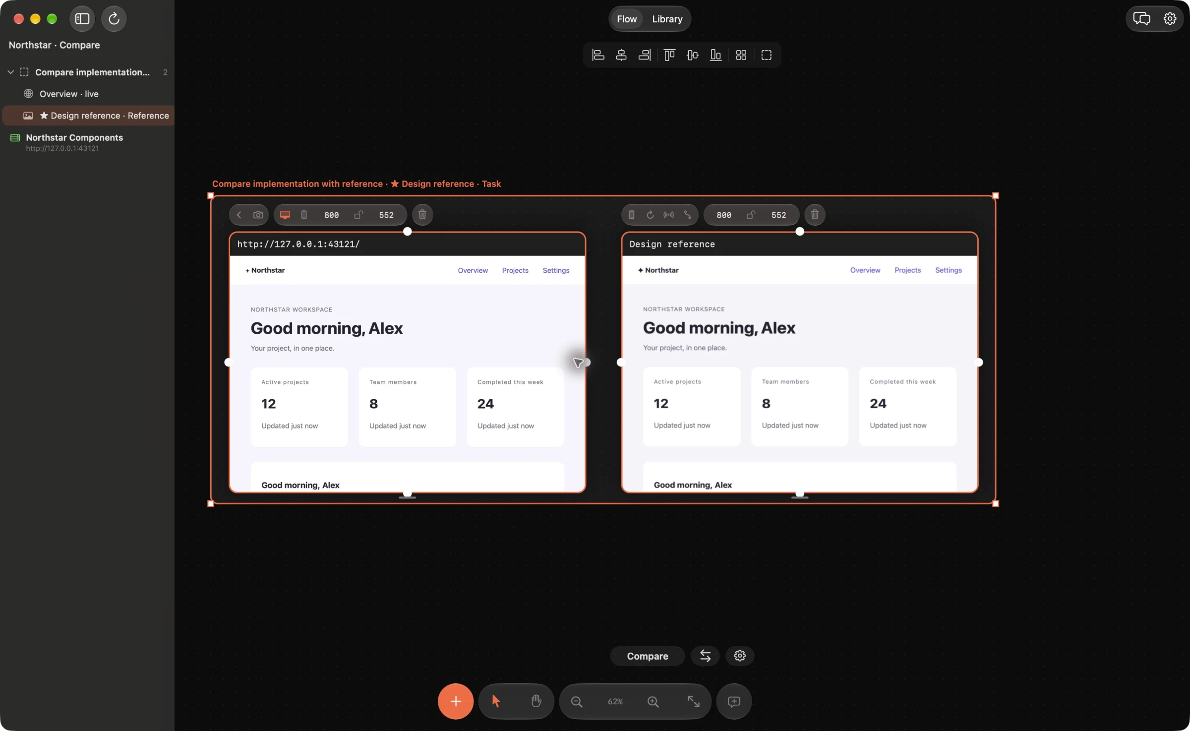
Start with the user’s next action
Choose one important flow, such as creating an invoice or completing a booking. Use realistic content and ask: what should the person notice first, understand next and do now? A screen full of equal-sized cards and equally prominent buttons gives every element the same priority.
For an invoice app, “Send your first invoice” with one clear “Create invoice” action may be a more useful starting point than a generic “Dashboard” heading above five competing actions. This is an example of choosing a hierarchy, not a template every app should copy. Keep secondary actions available without making them compete with the main task.
Make a few visual rules repeat
Inspect typography, spacing, alignment and color separately. Reuse a small set of existing text styles and spacing tokens rather than asking the agent to invent a different value for each gap. Align related content to common edges. Use the same visual treatment for actions with the same purpose.
Pick one button, input or card to follow and put its variants in a section. Choose the reference yourself, then describe which properties should match. Keep semantic differences: a destructive action should not become a primary action just because both are buttons. The reference-component guide covers the section controls.
Replace vague prompts with visible evidence
Add the live page and a relevant screenshot, exported design or PDF page to your board. Match the viewport and state before comparing. Pin a comment to a specific region: “Align the form heading with the input labels” gives the agent a clearer target than “Make it premium”.
Limit the first patch to one category of change. For example, fix spacing and alignment before reconsidering the color palette. Preserve the content and interactions unless the task explicitly changes them. Your reference should communicate intent; it is not permission to copy another product’s branding or proprietary assets.
Check the states a polished mockup leaves out
Review empty, loading, success, validation-error and disabled states. Try long names, real amounts and a narrow viewport. Check that a person can understand what happened and recover from an error. A beautiful screenshot of the happy path is not enough to establish a usable flow.
Use the keyboard and check visible focus, form labels, reading order and contrast. The W3C WCAG quick reference provides accessibility criteria and techniques. An AI visual comparison can help spot visible problems, but it does not establish accessibility conformance.
Review the patch and repeat the same task
Use your connected coding agent to propose a focused change. For supported web source, inspect the source diff before Apply in Web Frames’ built-in Fix workflow. For a native app, review Swift or Kotlin changes in your external agent’s workflow, then build and refresh the saved capture. Reload the UI and repeat the original task at the same viewport, including the error or loading state you recorded.
Keep the improved screen beside the reference and resolve feedback only after checking the result. When the flow is coherent, move to the next screen. This gives a vibe-coded prototype a deliberate design direction through a series of reviewable decisions.
Example agent brief
Adapt the frame and section names to your board. Send this through your connected agent.
Review the checkout frame at its current viewport. Identify the three most important hierarchy, spacing or consistency issues, with exact regions. Use the chosen component reference and existing tokens. Propose one minimal patch, preserve behavior, and list the states I should verify before Apply.
Try this on your next review
Web Frames 1.1.9 runs on Apple Silicon Macs with macOS 15 or later.
Download Web Frames 1.1.9